Showing posts with label video. Show all posts

Sunday, 17 November 2013

Fast News- Stylish WordPress Theme (Blog / Magazine)

Change log


FastNews - 1.0.1 (Released 2013-10-25)
======================================
- Fixed: blog-1 in category and search.
- Fixed: correct wording of search box
- Fixed: header social links still appear when left blank.

Fast News- a stylish and clean magazine WordPress theme!


Fast News is a straightforward and feature-rich magazine WordPress theme. Fast News has been built by using some of the most popular current design trends as HTML5, CSS 3, jQuery. Fully responsive, it has really great look and is very attractive on any device.


With its professional layout, it’s easy to customize. Fast News can be set up quickly and easily, whether you’re an experienced developer or occasional blogger. It provides everything you’ll need to create a professional looking website. Fast News- responsive magazine WordPress theme is perfect choice for your magazine, blog and news websites.
This magazine WordPress theme was designed and coded by KOPATHEME


Video Guides


Video guides show you how to use the theme


Features


  • Fully Responsive

  • Unlimited colors options with color picker in backend

  • Built with Boostrap and retina ready

  • HTML5 and CSS3 tableless design.

  • Custom fonts with 600+ Google fonts

  • Visual shortcode generator

  • Unlimited sidebar.

  • A lot of widget elements

  • Easily adding Google analytics, logo, favicon, social links …

  • Works in all major browsers: Internet Explorer (IE 8+), Firefox, Opera, Safari, Google Chrome

  • Theme Update Notifier.

  • Localization Support

  • Documentation included


Support


  • Support through our support forum at http://kopatheme.com/forum

  • We are available for customize the theme if you need. Please send us your email at kopatheme@gmail.com
    In working day (from Monday to Friday), all the question or problem related to our product will be responded within maximum 24 hours. No matter how long it takes, we will support you until the problem is completely fixed. Support request sent during weekends will be processed on next Monday morning.


Sources and Credits


The above demo images are copyrighted to their respective owners under Creative Commons-licensed for commercial use, adaptation, modification or building upon. The images are used for demo purpose and are NOT included with the download.


Whether you are a startup with limited resources and time or looking to give a magazine/blog look and feel to your next web project, Fast News responsive magazine WordPress Theme got you covered!

ForceFul- Stylish Magazine WordPress Theme (Blog / Magazine)

ForceFul- Stylish Magazine WordPress Theme


ForceFul is a stylish magazine WordPress theme which has really great look and is perfect for newspaper/magazine websites. Simple to use, ForceFul has been built by using some of the most popular current design trends and is completely responsive and retina ready, it bring you ultra responsive layout which fits best on every screen size and make your content visible on all devices.


ForceFul can be set up quickly and easily, whether you’re an experienced developer or occasional blogger. It’s designed to be customizable to exact requirements – putting you in control of the look and feel of your website in moments. ForceFul- responsive magazine WordPress theme is perfect choice for your magazine, blog and news websites.
This stylish magazine WordPress theme was designed and coded by KOPATHEME


Video Guides


Video guides show you how to use the theme


  1. How to set up ForceFul- Magazine WordPress Theme?

  2. How to customize layout for home page in ForceFul


Features


  • Fully Responsive

  • Easy to customize layout with visual layout manager

  • Unlimited colors options with color picker in backend

  • Built with Boostrap and retina ready

  • HTML5 and CSS3 tableless design.

  • Custom fonts with 600+ Google fonts

  • Visual shortcode generator

  • Unlimited sidebar.

  • A lot of widget elements

  • Easily adding Google analytics, logo, favicon, social links …

  • Works in all major browsers: Internet Explorer, Firefox, Opera, Safari, Google Chrome

  • Theme Update Notifier.

  • Localization Support

  • Documentation included


Change log


ForceFul - 1.0.6 (Released 2013-10-31)
======================================
- Removed: IE scripts from wp_enqueue_scripts hook. Added: lt IE 9 scripts in header.php before wp_head hook. (Fix IE display issue)
- Fixed: Weird spacing, page has gotten wider on 1920x1080 resolution screen
- Modified: date to date_i18n for weather widget to retrieve the date in localized format.
ForceFul - 1.0.5 (Released date Otc 30/ 2013)
===================================
- Modified: header-top structure to fix problem with extra space at the right side.
- Added: comment from facebook for theme
- Improved: Kopa Quick Sort widget supports ajax load more posts
- Fixed: problem when using multiple tab widget
- Added: option for whether or not automatically add home menu item
- Added: option show/hide view count of posts

Version 1.0.4 ( Released- 26/10/2013)
===================================

- Changed: 'Older Article' to 'Previous Article' in post navigation template .
- Added: option social links target
- Added: option show/hide breadcrumb
- Added: option number of posts in header ticker
- Modified: site markup structure, move r-color inside l-col to fix overlap content issue
- Added: id and classes for page content
- Added: body class for 404 template
- Modified: styles for new site structure
- Add New: option body text color
- Removed: fix height script
================================================
version 1.0.3 ( Released- 14/10/2013)
================================================
- Added Right to Left Languages Support
- Fixed: problem when left column height change
- Correct spelling: Lastest to Latest
================================================
Version 1.0.2 - 10/10/2013
================================================
- Added Single post rating system
- Custom weather widget: you can customize the settings of weather widget.
- Fixed issue of displaying article view count
================================================
Version 1.0.1-19/09/2013
================================================
- Improved: weather widget, auto detect customer location by ip,
display customer weather base on their city.
- Added: show/hide for header headline.
- Added: show/hide featured post thumbnail

Support


  • Support through our support forum at http://kopatheme.com/forum

  • We are available for customize the theme if you need. Please send us your email at kopatheme@gmail.com
    In working day (from Monday to Friday), all the question or problem related to our product will be responded within maximum 24 hours. No matter how long it takes, we will support you until the problem is completely fixed. Support request sent during weekends will be processed on next Monday morning.


Sources and Credits


The above demo images are copyrighted to their respective owners under Creative Commons-licensed for commercial use, adaptation, modification or building upon. The images are used for demo purpose and are NOT included with the download.


Whether you are a startup with limited resources and time or looking to give a magazine/blog look and feel to your next web project, ForceFul- Stylish Magazine WordPress Theme got you covered!

News-mix Responsive Magazine WordPress Theme (Blog / Magazine)

News-mix Responsive Magazine Wordpress Theme


News-mix is a Responsive Magazine Wordpress Theme designed specifically for the magazine websites. The theme is a clean, nice and fully responsive magazine WordPress Theme. With its professional layout, it’s easy to customize. It provides everything you’ll need to create a professional looking website.


Video Guides


Video guides show you how to use the theme


  1. How to setup News Mix theme – Part 1

  2. How to setup News Mix theme – Part 2


Features


  • Unlimited colors options with color picker in backend

  • Responsive layout.

  • HTML5 and CSS3 tableless design.

  • Easy to customize layout with visual layout manager

  • Custom fonts with 600+ Google fonts

  • Visual shortcode generator

  • Several layout style

  • Custom Widget

  • Unlimited sidebar.

  • Easily adding Google analytics, logo, favicon, social links …

  • Live jQuery Adding Comment validation .

  • Works in all major browsers: Internet Explorer, Firefox, Opera, Safari, Google Chrome

  • Theme Update Notifier.

  • Localization Support

  • Theme comes with a detailed documentation.


Change log


* News-mix Version 1.0.2 released date: Oct 23/2013
===================================================

- Removed: IE scripts from wp_enqueue_scripts hook. | Added: lt IE 9 scripts in header.php before wp_head hook
- Added: comment from facebook for theme

- changed the layout for front page , added a new sidebar

- Added a new widget: Kopa Divider to use with new sidebar

* Version 1.0.1 released date : Sep 19/2013
================================================

- Added: filters content for single post content

- Apply filter the_content for video, gallery, audio post content

- Fixed kopa text widget

- Fixed child theme created problem

- add show, hide option for header headline

- Fixed scroll headline when first load

- Fixed responsive css

- Added: video, gallery support for articles carousel widget, entry tabs list widget

- Fixed fullwidth custom page layout save

- Display thumbnail of video post format if no videos has been entered

- Change curl to wp_remote_get

Sources and Credits


Support


  • Support through our support forum at http://kopatheme.com/forum

  • We are available for customize the theme if you need. Please send us your email at kopatheme@gmail.com

  • In working day (from Monday to Friday), all the question or problem related to our product will be responded within maximum 24 hours. No matter how long it takes, we will support you until the problem is completely fixed. Support request sent during weekends will be processed on next Monday morning.


News-mix_Responsive Magazine WordPress Theme is designed and coded by http://kopatheme.com

Cube: Front-end Multimedia Publishing WP Theme (Blog / Magazine)


Cube is a powerful WordPress theme which gives you the ability to publish content
including all kind of multimedia post types without needing to go to WordPress Admin


Full Features List


  • 5 Page Templates

  • Multi-media support : Audio,Video,Magazine

  • Retina Ready

  • Responsive

  • Written with WP-Debug ON

  • Threaded Comments Support

  • Drop-down menu support (nested menus)

  • HTML W3C Valid

  • Revolution Slider Included

  • Masonry Home Page

  • Author Profile Page(front-end)

  • Author Edit Profile Page(front-end)

  • Build Home Page Categories and Custom HTML Dynamically(page-builder)

  • Native Audio Support

  • Native Video Support

  • Vimeo & Youtube Support

  • Choose between Facebook, Disquss or Native Comments

  • Front-end submission form

  • Front-end user registration + facebook login

  • Dummy Content Included

  • Clean Design

  • All Google Fonts Included

  • All famous social networks included

  • Unlimited sidebars

  • 20 PSD’s included

  • 10 Shortcodes included

  • Translation Read (.mo and .po files included)

  • Child Theme Ready

  • Short-code Generator (Build Shortcodes easy using our UI)

  • Unlimited theme updates + lifetime support

  • Google Maps

  • Ajax Contact Form

  • Rich Option Panel

  • Unbranded Options Panel

  • Twitter Footer with newest Twitter API (number of request increased)

  • Built In Gallery

  • Built in Personal Reviews

  • Internal Like System

  • Search Autocomplete, Youtube Style

  • Built with Bootstrap

  • Minimal White Skin+

  • Video AutoPlay Optional


Changelog

1.7
Fixed Author Edit/Delete Buttons
Minor Bug Fix
assets/css/bootstrap-responsive.css
content-profile-post.php
functions.php
includes/sidebars.php
page.php
style.css
template-home-revolution.php
template-submit.php
widgets/widget-topposts.php

1.6
Video AutoPlay Feature
assets/js/script.js
formats/format-video.php
functions.php
header.php
includes/custom-fields.php
style.css
template-home-slider-2.php

1.5
Brand new page with slider
assets/css/bootstrap-responsive.css
assets/css/bootstrap.css
assets/css/dynamic.php
assets/css/style.css
assets/css/white.css
assets/js/script.js
content-home-post.php
content-related.php
content-reviews.php
formats/format-audio.php
formats/format-magazine.php
formats/format-video.php
functions-backup.php
functions.php
header.php
includes/aq_resize.php
includes/custom-fields.php
includes/tgm/plugins.php
page.php
single.php
style.css
template-home-masonry.php
template-home-revolution.php
template-home-slider-2.php
template-home-slider.php
template-home.php
template-submit.php
user-edit-profile.php
user-profile.php

1.3
Fixed Options Page Permissions
User can choose number of posts per category on home page
Brand New White Skin - Complete change of the feel of theme

1.2
Integrated Sharethis into post
Boxed and Wide Layout
Background Pattern and Background Image option
Reviews can contain decimal numbers

v1.0.1
Fixed Search Bar.
Add option : Disable Post Views.
Add option : Disable Post Likes.

Lucid - Clean Personal/Blogging Theme (Blog / Magazine)

A clean, responsive and content-first Blogging/Personal WordPress theme


Lucid is a clean, simple and minimalistic responsive blogging/personal WordPress theme which focus on content and readability. Supports 6 post formats let you create posts easily. It is super-duper fast and easy to setup, bundle with easy theme options and shortcodes plugin.


If you like Lucid, don’t forget to rate it.


They Said…


Beautiful design! It was so easy to integrate into my blog…

:):):-)

Thank you.
— ajaimes


Great theme!

— fiercecreations


So far so good!

— Csmithchicago


Updates


v1.0 - Initial release


Features List


  • Clean and Responsive design

  • 6 Post Formats: Standard, Image, Gallery, Audio, Video, Quote

  • Very easy to setup

  • Theme Options

  • Translation Ready, .po file included

  • HTML5 & CSS3

  • Widget Ready

  • 7 Shortcodes

  • Page Template

  • Unlimited Accent Colors

  • Custom Widgets


Credit


BlogTime - Blogging and Portfolio WordPress Theme (Blog / Magazine)

\    \    \    \


BlogTime is a responsive blogging and portfolio WordPress theme.


\


All Features


Full post format support including audio player through MediaElement.js
Responsive design so it looks great across all sized devices.
Portfolio section with isotope filterable gallery and single portfolio post design.
Theme Options to easily setup your theme (view screenshots to see options available).
Shortcodes integration through the free Simnor Shortcodes plugin.
No bloated code, everything nicely commented and organised ready for developers.
Widget Ready sidebar (simply don’t add any widgets to use theme in full width mode).
Full Width page template.


Support


Support is provided via the support forum over at Simnor Labs where you can also find the documentation and knowledge base articles.


Credits


Lato font from Google Web Fonts: http://www.google.com/webfonts/specimen/Lato
Isotope: http://isotope.metafizzy.co/ We have a valid developer license.
PrettyPhoto Lightbox: http://www.no-margin-for-errors.com/projects/prettyphoto-jquery-lightbox-clone/
Font Awesome icon font: http://fortawesome.github.io/Font-Awesome/
Zocial icon set through the fontello icon font generator: http://fontello.com/
Portfolio images are from PlaceIt: http://placeit.breezi.com/ you can create your own images there.
Blog post images are from Burning Well: http://www.burningwell.org/ and Pixabay: http://pixabay.com/en/


Changelog


= 1.1 =
* style.css Fixed URL comments field that became unstyled in WP 3.6 release
* style.css Fixed comment name that changed styling in WP 3.6 release
* includes/theme-functions.php Added comment author link to colour CSS


= 1.0 =
* First release.

Ezyland - Responsive multipurpose landing page (Landing Pages)

Ezyland Multipurpose landing page – A perfect start up template for companies, individuals and professionals. This template was designed with Responsive design, HTML5 / CSS3 , Responsive slider, Video Support, Working contact form and much more..


This template is Valid Html so will work cross platforms and browsers.


FEATURES


  • Responsive Flat design

  • HTML5 / CSS3

  • Foundation framework

  • Responsive slider

  • Working contact form

  • Social Icons

  • Rotating quotes

  • Responsive carousel

  • Animated rotating twitterfeed

  • Well Documented

  • No coding knowledge required

  • Valid HTML


CREDITS


All files and resources I’ve used are located below. A big thanks goes out to those who have made it possible to let us use there resources for commercial purposes.


Images in live preview are not included to the template.


Need help? Just ask nicely and i’ll try to rescue you as soon as possible.

Helios | Modern Responsive Theme for Ghost (Ghost Themes)

\\\\\
\


Extended Feature List


Helios is a modern responsive theme for Ghost.


  • Fluid Masonry Layout

  • 6 ready-to-use color schemes included

  • Easy setup social links

  • Easy setup Disqus comments

  • Share buttons – Let your visitors easily spread your content.

  • Fancy CSS3 transitions

  • Supports Vimeo, Youtube, Spotify, Soundcloud and many more!

  • Built with the latest web techniques like Bourbon and Neat for SASS for maximum flexibility

  • Assets Builder included! (using Grunt.js)

  • 100% Responsive – Looks great on mobile, tablet and desktop.


Changelog


  • 1.0 – Initial release.

Interstellar - Ghost Theme (Ghost Themes)

Interstellar is a simple ghost theme with cool animated header.

Features

  • Font Icons
  • Twitter feed bar
  • Animated parallax header
  • You can set featured image or embedded iframe

Credits


Documentation Link

Jerro - Responsive One Page Round Template (Creative)

Jerro – Responsive One Page Round Template


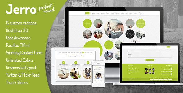
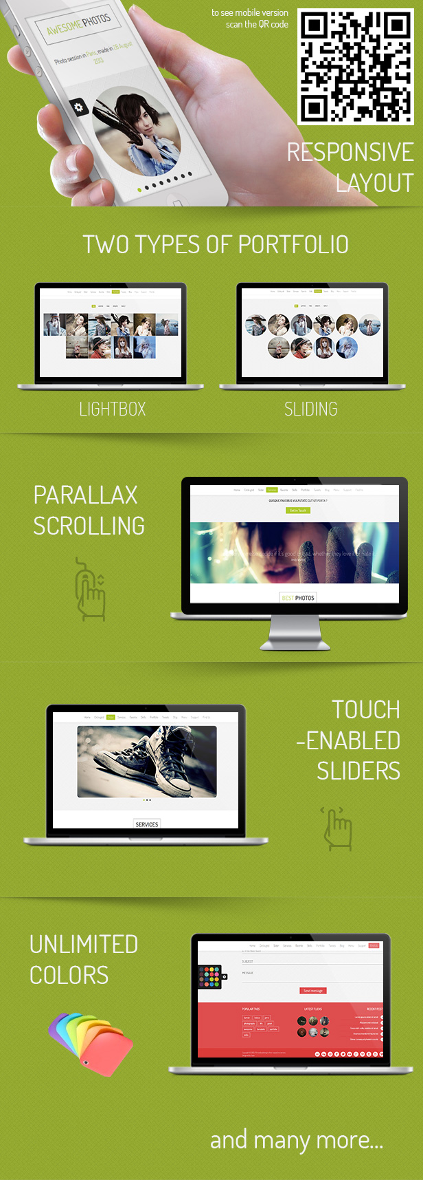
Jerro – is a modern template made in HTML 5, CSS3 and jQuery technology. The template is fully responsive and looks great on mobile devices. It contains 15 different sections that you can easily customize to your liking. Customize the color, add content, and enjoy your own website with a portfolio.


  • 15 Custom Sections

  • Bootstrap 3.0

  • Font Awesome

  • Parallax Effect

  • Working Contact Form with Validation

  • Unlimited Colors

  • Responsive Layout

  • Twitter & Flickr Feed

  • Touch Sliders

  • Valid HTML5 & CSS3

  • Cross Browser Support

  • jQuery Powered

  • Filterable Portfolio

  • Google Web Font

  • CSS3 Animations

  • Google Maps

  • PSD Source Included

  • Documentation Included


Others features:


The images used in the demo version are not included with the main download files.


PORTFOLIO PHOTOS:


Photos by Karrah Kobus


HEADER PHOTO:


Photo by boogy_man

SLIDER PHOTOS:

Wallpaper design: Almog Albalach
Photo by: Kenderson Tripald
—-—-—-—-—-—-—
Wallpaper design: Almog Albalach
Photo by: Almog Albalach
—-—-—-—-—-—-—
Wallpaper design: Almog Albalach
Photo by: Almog Albalach

PARALLAX PHOTOS:


- Wallpaper design: Almog Albalach
- Photo by: Kenderson Tripaldi
—-—-—-—-—-—-—
Wallpaper design: Almog Albalach
Photo by: Almog Albalach


VERSION HISTORY:


Version 1.0 (2013-11-01)
  • First release.


Photosoon - Responsive One-Page HTML Template (Creative)

Photosoon is clean and modern one page template, designed for many kind website such as gallery site, portfolio, personal site, corporate, business etc.
This template built with twitter bootstrap and PHP script included for contact form.
coming with awesome fixed navigation, parallax effect, and AJAX contact form .


Feature


  • Clean and Responsive Design

  • Retina ready

  • FLAT Design

  • PARALLAX Background

  • Slider Image Background

  • Video Background

  • Framework Bootstrap

  • AJAX Contact Form

  • Isotope Portfolio

  • Twitter Feed Slider

  • Styled Google Maps


Update:
- 3 files index fixed
-- index = text slider
-- index_2 = Image Slider
-- index_3 = Video Background

Notes:
- Images in live preview isn't included. You can replace with your own images.

Eidolon | Ghost Theme - Responsive & Retina Ready (Ghost Themes)

Eidolon is a brand new theme for a brand new blogging platform. Packed with cutting edge solutions and built using HTML5 & CSS3, Eidolon is the perfect solution for your Ghost based blog.


Features


  • brand new Ghost blogging platform

  • HTML5

  • CSS3

  • jQuery

  • custom JavaScript

  • responsive layout

  • retina ready

  • free support guaranteed


Theme Support


Eidolon Mobile

The Tree - Unique HTML/CSS One-Page Template (Personal)

“The Tree” is a stylish HTML/CSS site template suitable for your own portfolio. We worked really hard on creating this HTML5 & CSS3 portfolio website template.
Everyone of the words of the tree can be changed with new one!

“The Tree” is different, creative, innovative and user friendly template that you may enjoy having for your portfolio, personal site or something else. The unique and clean design allows you to use the template for every kind of your business.
“The Tree” Portfolio template give you the possibility to make a unique portfolio website that stands out of the crowd! This is a perfect way to display your creative work. You can easy change background color and the color of active buttons with other. “The Tree” is too easy to edit with your own content.


Theme features


  • Stylish and unique design.

  • Fancybox gallery – you can show uploaded images from the Projects.

  • A place where you can enter your skills.

  • A place where you can.

  • post opinions from your clients.
  • Jquery enhanced user interface – tabs, lightbox photo preview.

  • Social information – facebook, linkedin, twitter, etc.

  • Layered Psd File.

  • HELP files included.


Sections:


  1. About

    • Team

    • Skills


  2. Projects

    • Opinions (Comments) – Opinions of your clients


  3. Services

  4. Social information

  5. Contacts – contact form

  6. Find – this includes tree sections.


    • In the first one you can write your address.

    • In second one your location.


    • And in the last one you can post your phone and email.


  7. Footer


See also our other site template