Showing posts with label fullscreen. Show all posts

Sunday, 17 November 2013

RedInk - Responsive HTML5 Template (Creative)

RedInk is a creative portfolio template built for users who want to showcase their works in a stylish and intuitive way. Being simple, easy to use and straight to the point, RedInk makes the user experience pleasant and useful, while concentrating the attention on your talent and skills.


RedInk is built using the latest technologies including CSS3 transitions for optimized performance and is fully responsive, meaning that it will work perfectly and run smoothly on any device, from notebooks to desktops, and from smartphones to tablets.


FEATURES


  • Responsive and Mobile Friendly

  • Fullscreen home page slider

  • Fullscreen image background for each page

  • Unique layout and animations using CSS3 transitions

  • Portfolio page with filters and pagination

  • Unique fullscreen portfolio showcase

  • Blog pages including functioning comment system using Disqus

  • Functional Contact Form


Design and concept by Yellow Bridge

Grafenberg - Responsive Tumblr Template (Blog)

Need Support?New Items And UpdatesFacebook UpdatesTwitter Updates


Grafenberg – Responsive Tumblr Template


Grafenberg is a responsive, blog style template for Tumblr with the fullscreen slideshow in the background. It’s dead easy to use and transform and it supports all types of posts.


Features:


  • Responsive layout

  • Cross-browser compatibility

  • Custom CSS

  • Easy and rich customization

  • Custom pages

  • All post types supported

  • Social sharing

  • Google Analytics

  • Disqus comments

  • About section

  • Ask and Submit feature

  • Up to 6 slides

  • Text widget


This template uses:


  1. Font Droid Sans – free Google web font.

  2. Font Merriweather – free Google web font.

  3. Super Mono Stickers.

  4. jQuery

  5. MaxImage2

  6. FitVids

  7. jQuery Share

  8. jQuery custom content scroller

  9. jQuery Cycle Plugin

  10. Photoset Grid

  11. Nifty Modal Window Effect


Package includes:


  • One fully editable and well organized PSD file

  • Template files

  • Detailed documentation


The images shown are not included with the item!


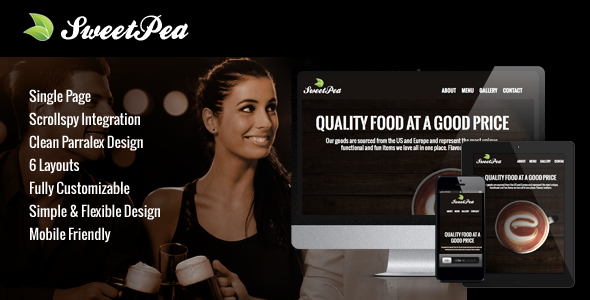
Sweet Pea - Responsive HTML One Page Template (Creative)

Sweet Pea is so clean, super flexible and has a fully responsive design! With a few tweaks to your settings, you can easily build something custom with very minimal effort. We’ve designed this theme to be mobile optimized, fully responsive, and retna ready! It fits dozens of screen sizes and is optimized to render graphics crisp and quick. Furthermore, for some of the more graphic heavy pages we offer lazy load support to keep your site running smoothly.


Overview


Sweet Pea is easy to use right out of the box, but it also has
some nice features for advance users. See the list of available features in the list below.


Latest Features


  • Fully Responsive Support for Android, Iphone, and Tablet Devices

  • Instagram Theatre plugin is now integrated and bundled with this theme

  • A Total of 7 New Plugin Settings

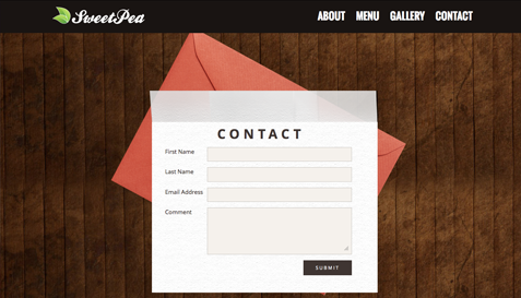
  • New Contact Form Design

  • Bug Fixes and Added Theme Flexability


Features


  • Six Slide Layouts


  • Non Conflicting Code Design


  • Lazy Load Support for Fast Loading


  • Iphone, Ipad, and Android Support


  • Fancybox Integration(Next Version)


  • Fullscreen Design


  • Jquery Animations And Effects


  • Weekly Downloadable Content


  • Stand Alone HTML,CSS,JQuery Version Included